Building Community: The Architect Talks About Creating a Gallery Good for the Soul
By Linda DishnerThere is one thing a designer likes more than completing a project, and that is to write about completing a project. Not only do I get to describe the architectural process, but I get to formally thank Karen and Jay for making the process an enjoyable and successful one as well.
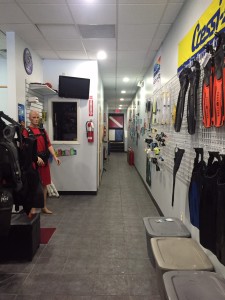
We began with a slightly-used scuba shop, which always struck me as a little out of place in land-locked Mount Kisco.
It was mostly turquoise, of course, and divided into several smaller spaces, a compressor room for the tanks, a repair room for equipment and a classroom area. The challenge was to take a narrow (it is more than 80’ long), poorly-lit retail establishment and transform it into a gallery-like space on a budget.
We began with the ceiling. The existing tiles and lighting (dating back to the Jurassic period) were uneven and mismatched, which contributed to the disconcerting feeling of a long, dark space and to my irrational need to make it orthogonal. Ceilings and lighting are a hard sell to clients. Spending a significant portion of the budget on one of those vague architectural principles, well, is not always immediately apparent. But Karen and Jay listened and starting looking up in other spaces and came back with the resolve to replace the ceiling.
Our next hurdle was where to place the counter. Once we placed the counter, we could fix our lighting and ceiling pattern. We knew that all the walls had to come down for a clean line of sight, but does it live in the front, the middle or the back of the space? We learned that because most of the parking is in the rear of the store, and there was street traffic (and light) from the front of the store, close to center was the optimal place. (And we were lucky enough to re-purpose the counter Karen had in the old shop, nice save K & J).
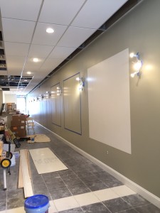
So how do you make an 80’ space not look like an 80’ space? You break up the long wall so it does not seem endless and this gave birth to our boxes.
With the use of paint and lighting fixtures the Schecters secured at one of the discount furnishings stores (at which we as designers can no longer turn up our noses) we have a clear, clean path that takes us down the space. The white floor tile shown in the photo occurs in the front and back of the store and hide the holes created by the former tenant’s creative construction practices. (Note how straight the ceiling grid and lighting pattern is!?!)
No discussion of the architectural process is complete without the mention of the team. It’s a simple equation: a good team produces good work. I’d like to thank Ruth Bushko, my colleague on this project for her expertise and infinite supply of good nature; Johnny Rodriguez and his carpenter, Jose Aguilar, and their staff for their dedication to completing the project on time and on budget; Edgar, the electrician who had to listen to the virtues of straight lines; and finally, the Schecters who have the imagination and knowledge to envision a gallery dedicated to the fostering of community spirit here in Mount Kisco and beyond.


